¶ Email Builder preview
NB! You can always create a new email template but you do not need to prepare it from scratch, the designer prepares a template for your use. This article just explains how to work with Email Builder.
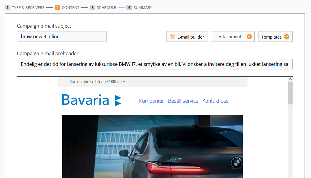
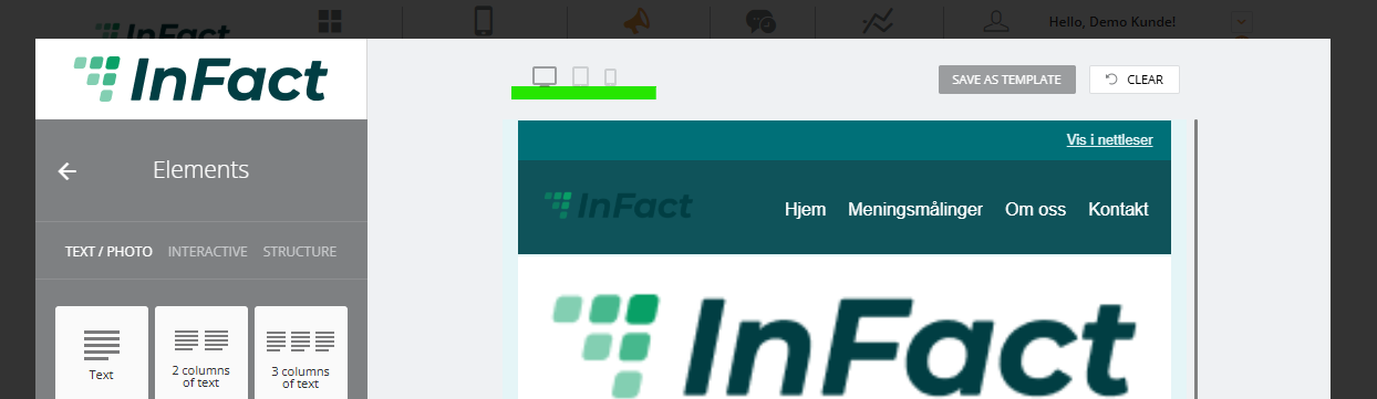
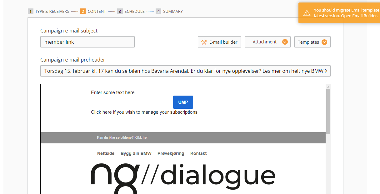
Email builder can be accessed via the second step of the Campaign builder.
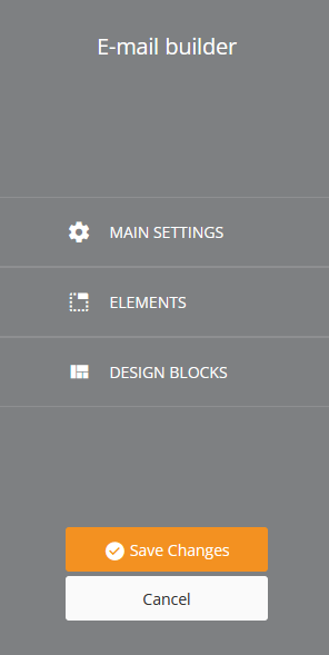
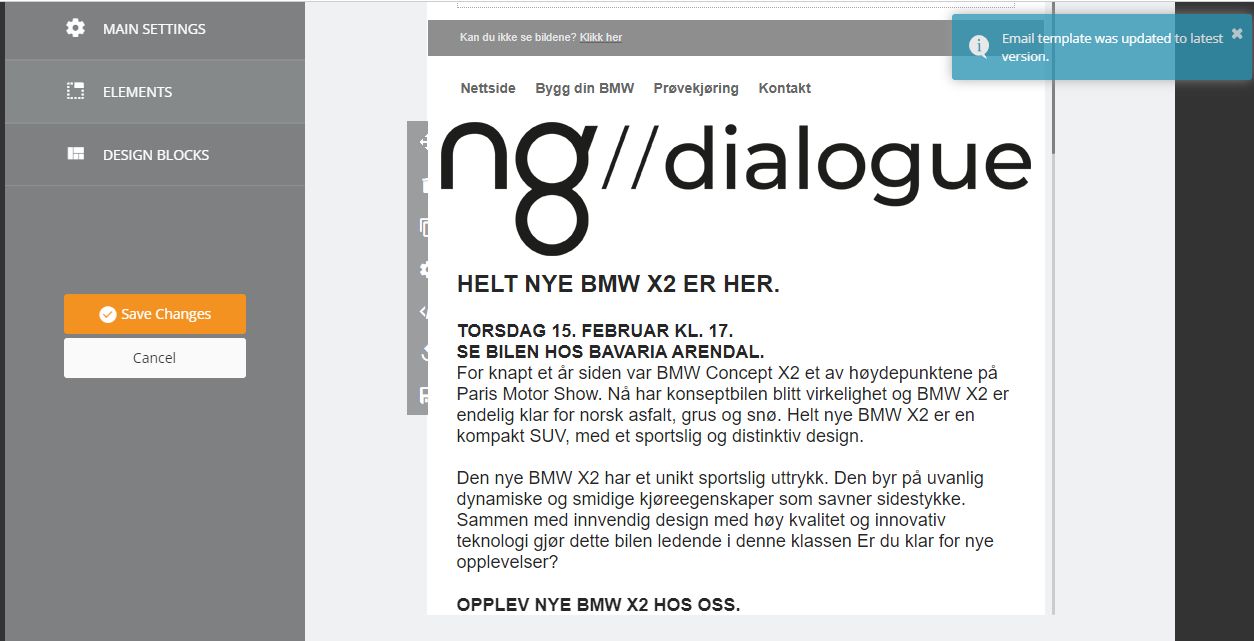
There are 3 sections: Main Settings, Elements, and Design Blocks.
¶ Main Settings
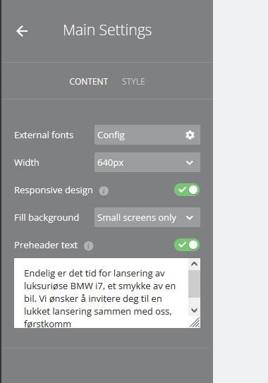
¶ Content
In Main/Content you can adjust fonts (if you have external ones) width, and use Responsive Design for all elements (Responsive email uses a media query, also known as @media — a special set of CSS styles that act like conditional statements or dynamic rules. Carefully planned, they can help make emails more readable on different screen sizes) or Preheader text (Preview text is a snippet of copy pulled in from the body of your email and typically displayed underneath the from name and subject line in a subscriber’s inbox. It is alternatively referred to as snippet text or a preheader).
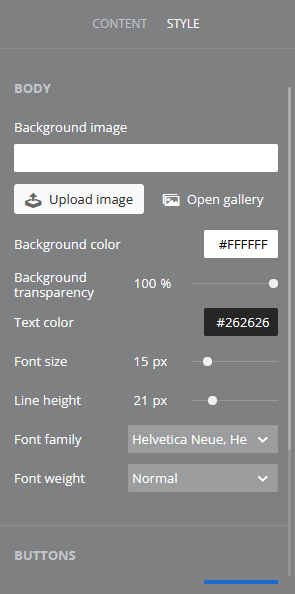
¶ Style
In Main/Style the next settings can be set:
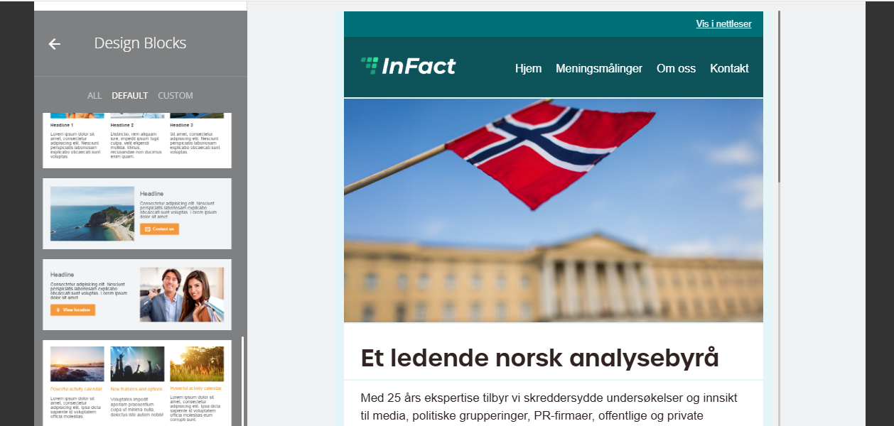
¶ Design Blocks
Design Blocks are premade blocks that can be Custom or Default. It already includes the specific background colors, fonts, and social media buttons (for a specific partner for example). To edit them, please, check out the Media Style Editor paragraph of this article.
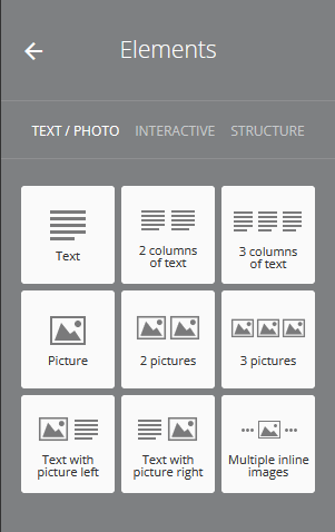
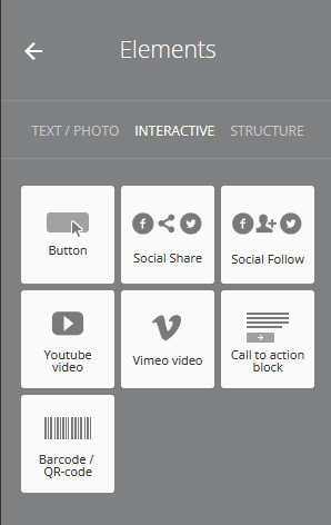
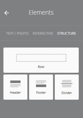
¶ Elements
Elements are Text/Photo, Interactive, and Structure:
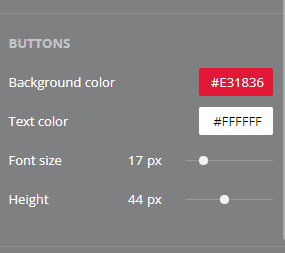
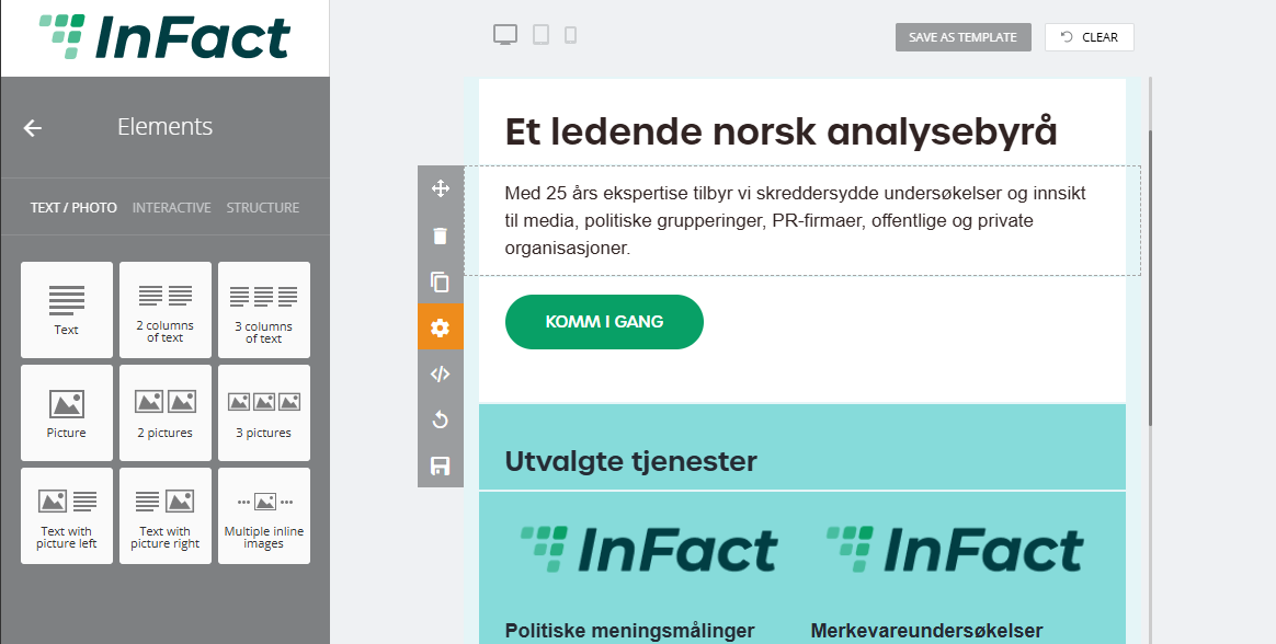
Each element, when adde,d has its own settings:
In the element settings, we can configure the element's background color, padding, font settings, etc.
¶ Additional settings
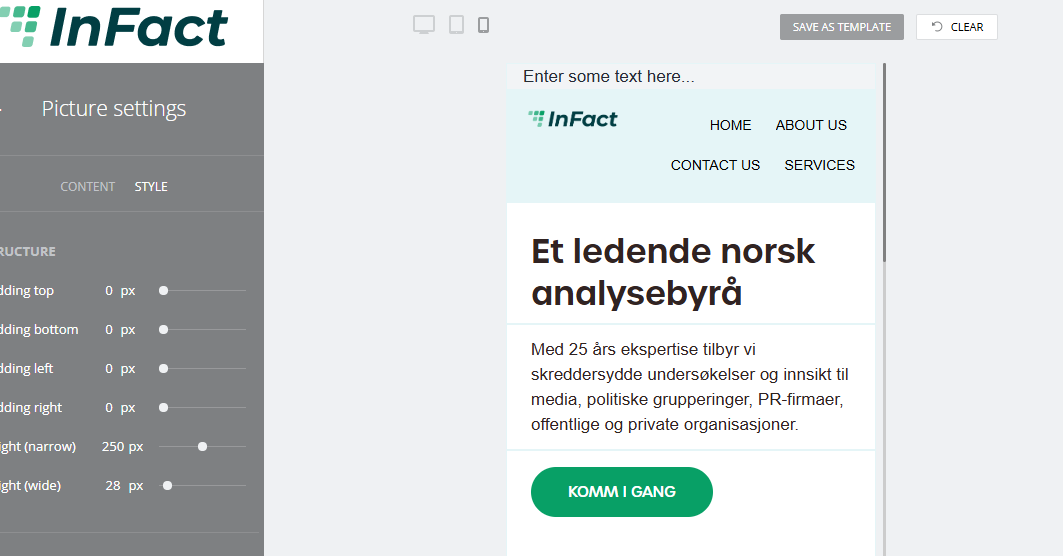
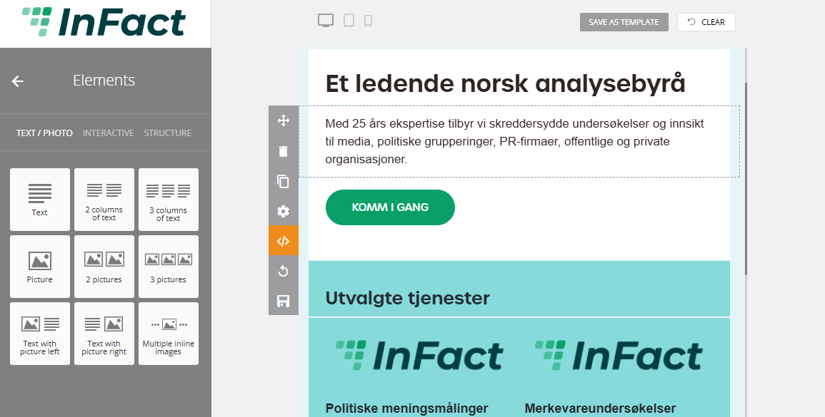
¶ Working with pictures
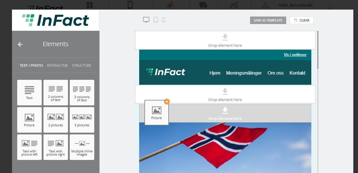
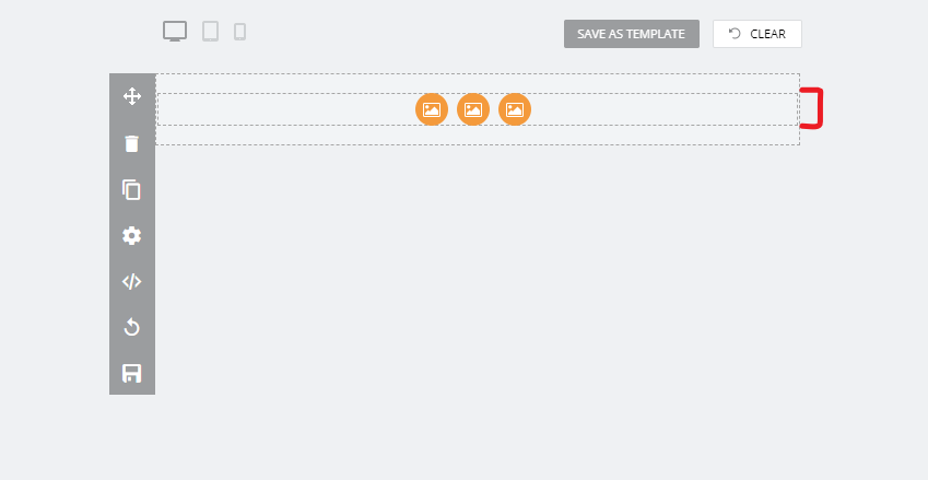
You can start by adding Picture or Pictures blocks to your Campaign (marked with light grey):
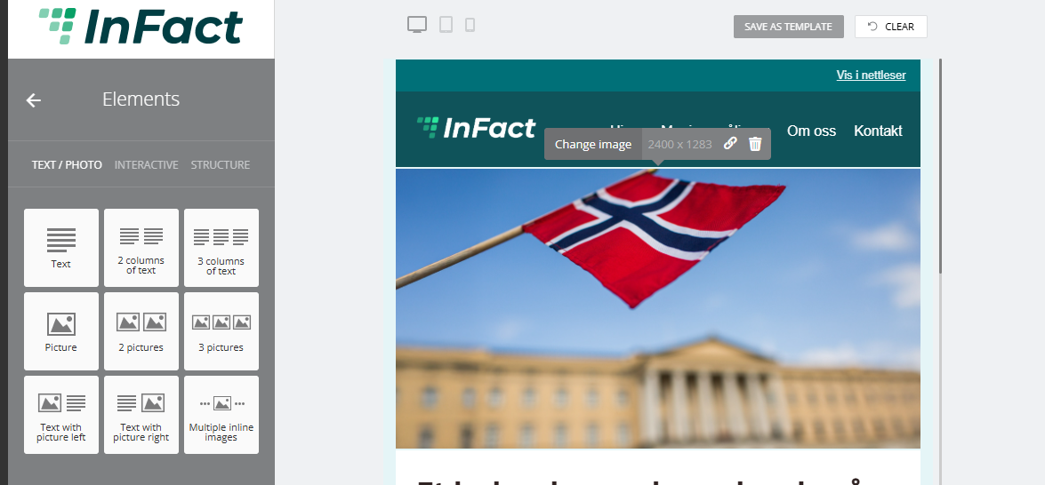
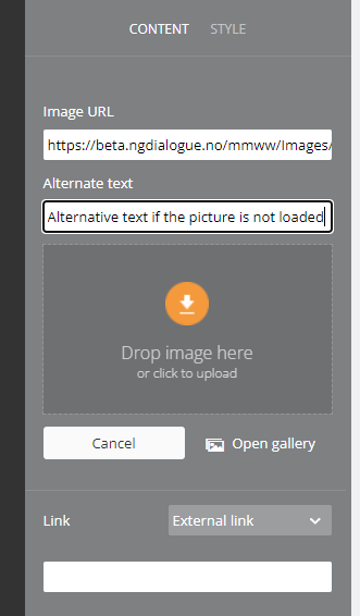
Then click the default picture and change the image:
Now you can upload your picture from the Gallery or your computer:
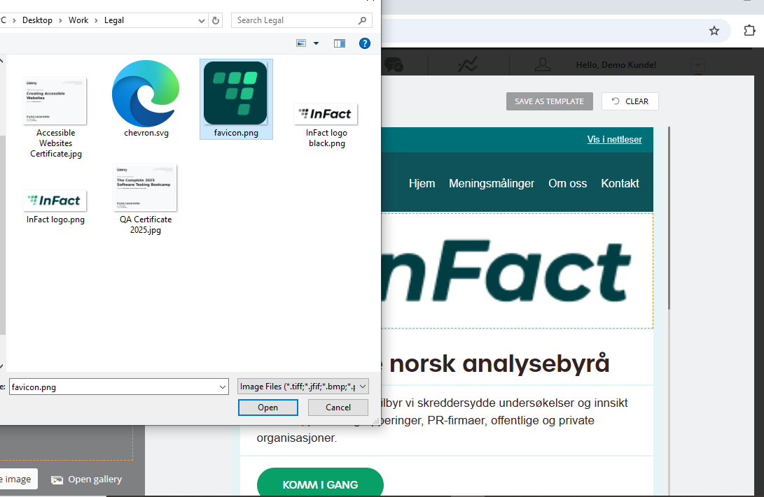
Or Drag & Drop the image directly from your computer:
To restore a picture, you need to add a block again.
You can change your image's alternative text:
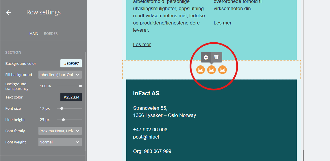
¶ InlineCanvasControl for multiple inline images
There is InlineCanvasControl which allows:
- manage settings for all images such as Horizontal/Vertical alignment, Height, Indent;
- remove images;
- add image by drag&drop picture element;
- add image by drag&drop image from explorer;
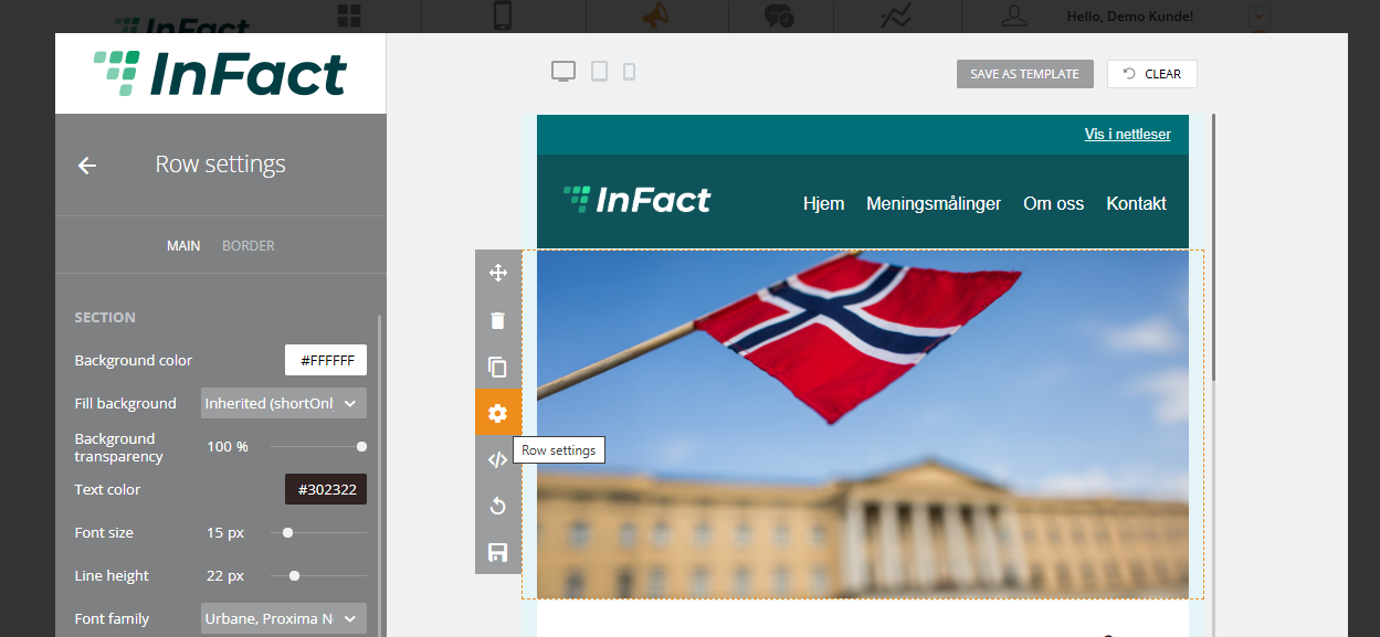
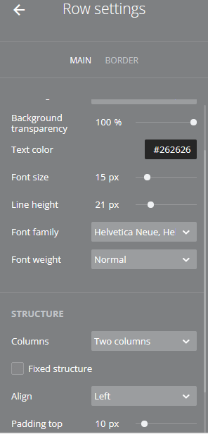
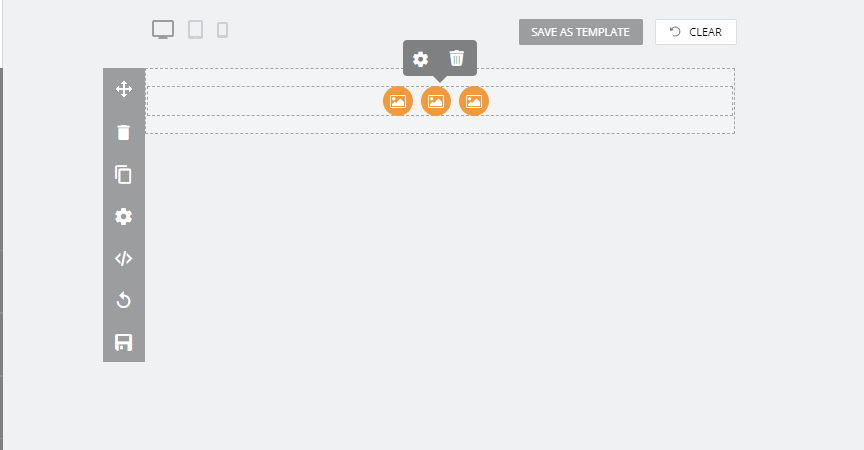
To access InlineCanvasControl, please select the row on the screenshot 1, then click on it and click on the gear icon on the screenshot 2, and the Control will appear on the left screenshot 3.
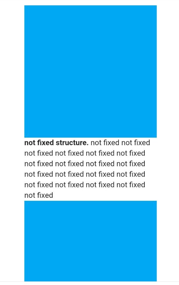
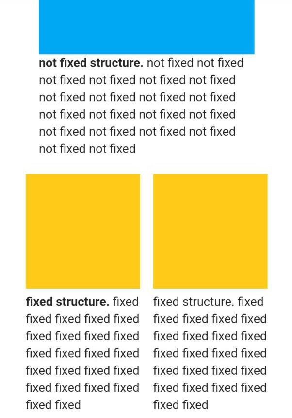
¶ Fixed Structure
Fixed Structure is especially important for 2+ column elements for phone view.
In the email view there is no difference between the same elements with the Fixed Structure on/off:
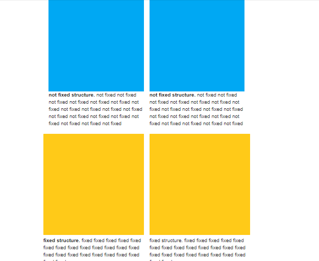
But in any other view where the screen width changes, the element with Fixed on remains the same while the one with Fixed off loses its column structure:
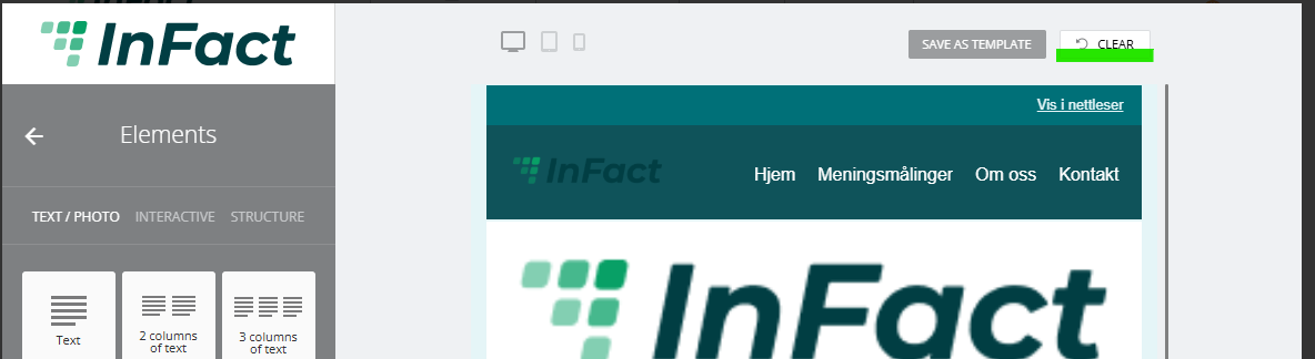
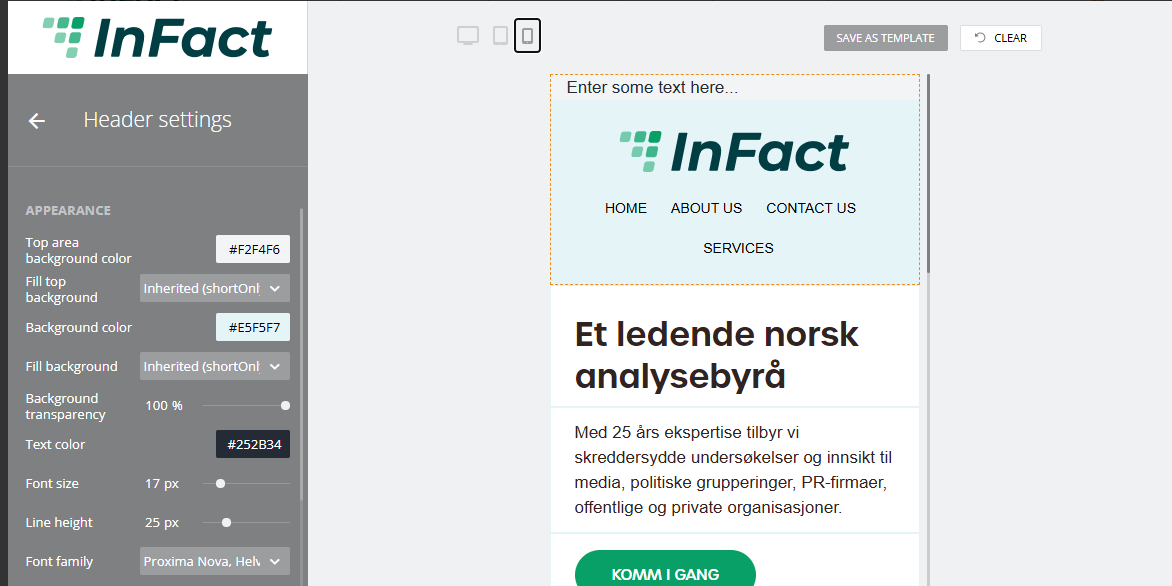
Email Builder allows you to test the look of the campaign view on different devices and save this email as a template:
¶ Clear option
¶ Background transparency
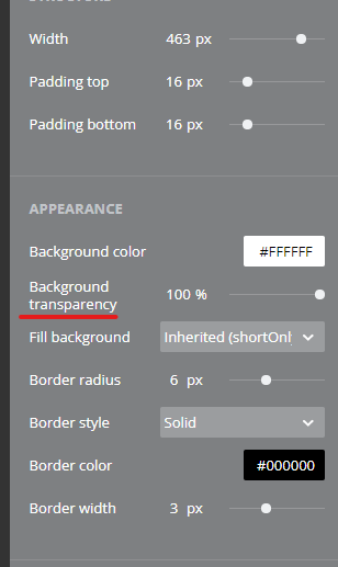
This option does not work for Outlook
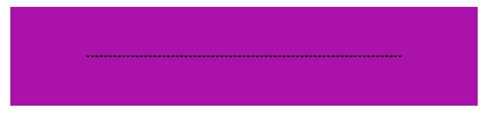
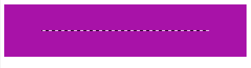
Also, in Outlook currently we cannot make buttons' edges circle-like and the divider element if dotted or dashed is not filled in with color:
Button has to look like this:

Outlook:
Border has to look like that:
Outlook:
¶ New Default Settings
These are the new defaults, but you can always change them. Here are the new default values in case you've done some changes and would like to get back to the defaults:
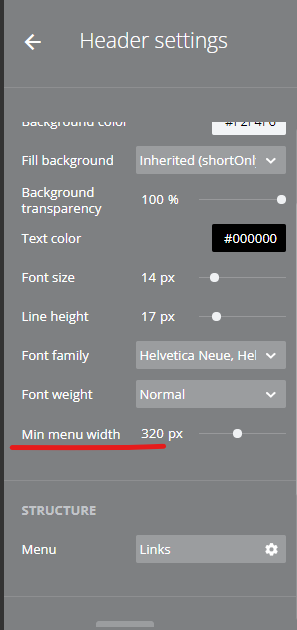
Header settings / Appearance
• Min menu width: 320px
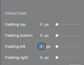
Header settings / Structure
• Logo position — remove option
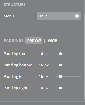
Header settings / OptionalPaddings: narrow
• Padding left: 16px
• Padding right: 16px
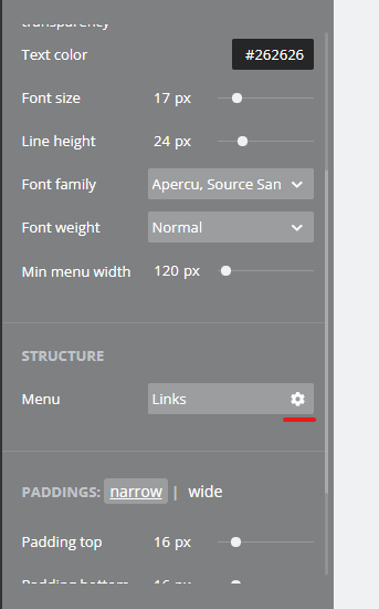
Header menu settings / Content / Structure
• Type: link only
Header menu settings / Content / OptionalPaddings: narrow
• Padding bottom: 0px
Header menu settings / Content / ItemsStructure
• Items Gap: 16px
• Padding top: 2px
• Padding bottom: 2px
• Padding left: 4px
• Padding right: 4px
Header menu settings / Style / Appearance
• Background color: Inherited (from Header settings / Appearance)
Header menu settings / Style / Type
• Line height: 32px
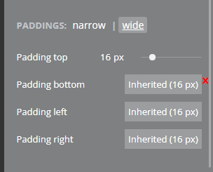
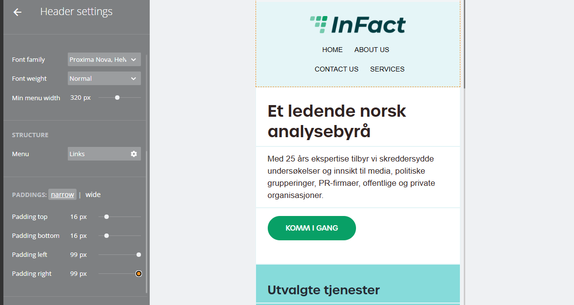
¶ Paddings
There are new padding settings for all main elements, such as the Header, Header menu, and Header logo. And we no longer have the Alignment option:
¶ Narrow and Wide options
Narrow width is determined by Logo Picture's real dimensions and Min menu width settings. The wide layout (mostly seen on laptop screens in browsers and desktop apps, but not always!) is basically the state when the header (logo and menu) is rebuilt in 1 line mode.
Its opposition - narrow mode - is when the header has 2 line structure.
Wide mode paddings can be 1. inherited from narrow mode paddings or 2. custom (to achieve this, click on the red cross in the right upper corner as shown on the screenshot):
There may be situation when the mobile view is wide enough that hold a wide (one-line mode) layout.
¶ Header
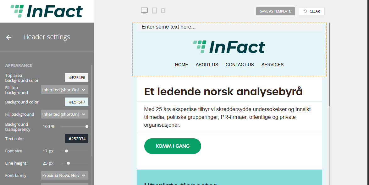
A new header version has different background color settings:
| Option | What it does |
| Disabled | background is not filled |
| Small screens only | background is filled for small screens like phones |
| Enable for all | background is filled for all types of screens |
| Inherited ( ) | background is filled depending on the main settings |
¶ Menu in the header
You can add buttons, change links and appearance.
To do this, scroll down to Header settings, Structure
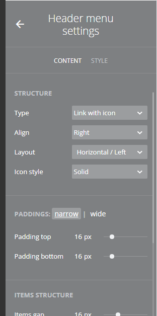
¶ Clicking on the gear icon will lead you to the Advanced menu settings:
¶ Items gap
See in the previous screenshot, the Items Structure section has an Items gap. Those are the gaps between menu icons (Home, Contact us, etc.).
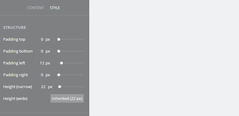
¶ Header's picture height
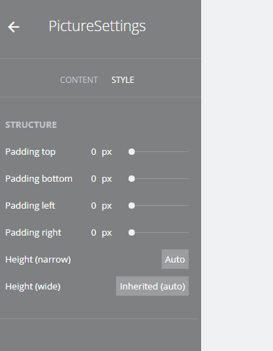
To access these settings, please click on the logo and choose “Change image”.
In the subsection Style, you can see paddings and height settings.
| height | values | values |
| narrow (the logo cannot fit into app/screen width) | auto (the system sets the height of the logo) | custom |
| wide (the logo can fit into app/screen width) | Inherited (settings are inherited from narrow mode) | custom |
¶ Default settings (wide and narrow heights are auto)
By default, we use the phone's header settings (as usually wide screens may stretch the pictures and we need to avoid that):
¶ Narrow is a set value and Wide is inherited
Sometimes there might be a need to customise headers` logos for some customers, to make it look different on phone or laptop, desktop or mobile version. And there is no need to set it up separately for the wide mode, we can use “inherited” option:
¶ Both Narrow and Wide modes are customisable
¶ Multiple headers
Please note you cannot add more than one header and footer. If, for testing reason,s you need more than one, you can copy the element but not add from the main menu
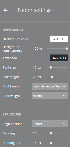
¶ Footer
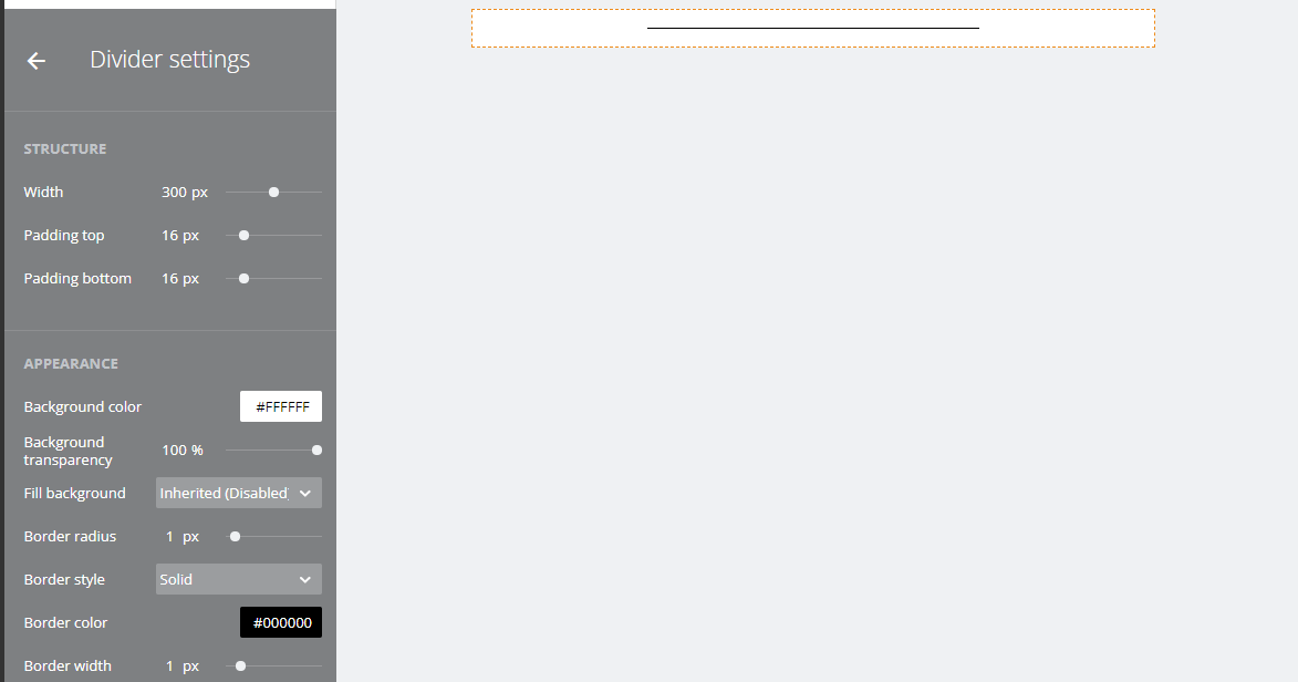
¶ Divider
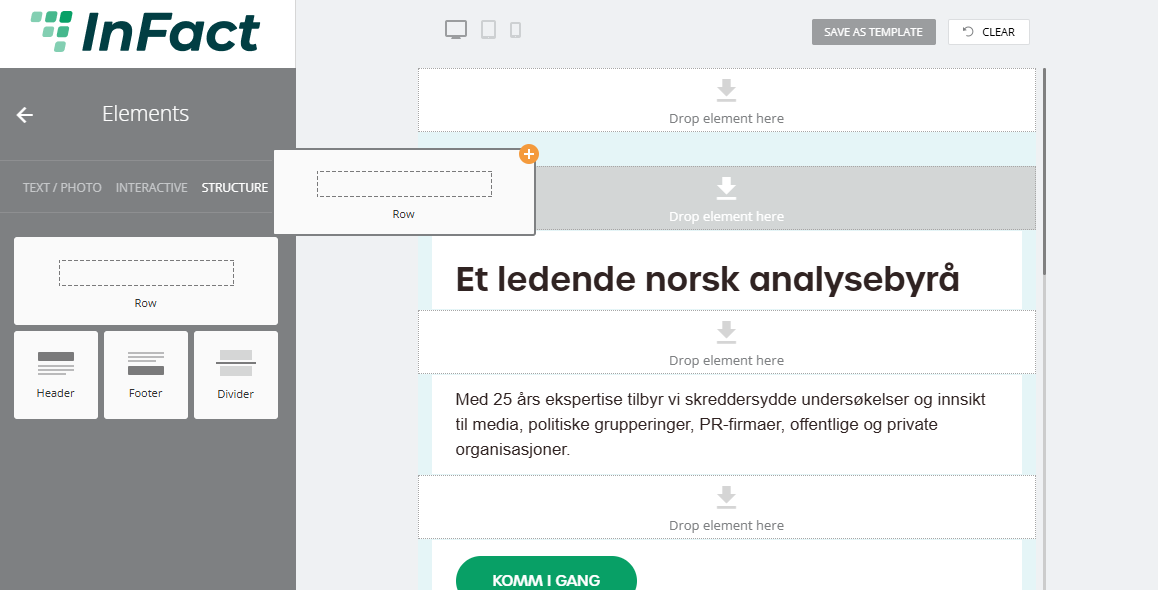
¶ Row
Add a Row element:
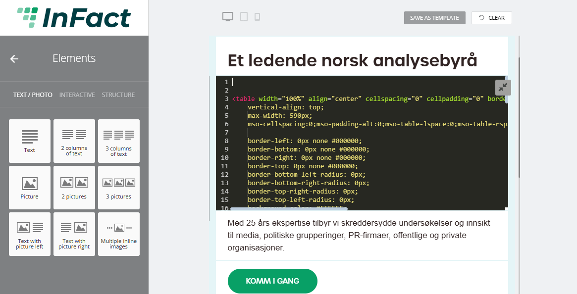
¶ Media Style Editor
To access it, you need to change your element by which you are actually making it a custom element
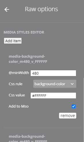
For example, access its code:
Make changes:
Save changes by clicking the same icon.
Then you can access Media Style Editor by clicking the block's settings:
¶ More Email Campaign Features
¶ Email Builder: Update popup
¶ Email Builder: How to add memberlink
¶ Email Builder: Click-to-email buttons and links
¶ Button
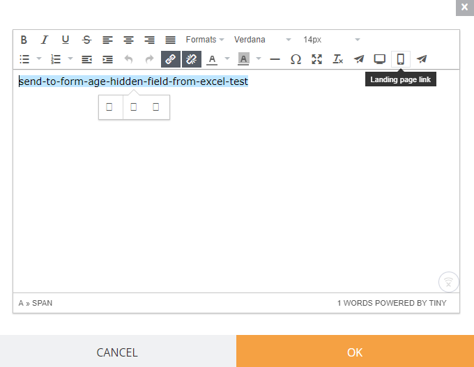
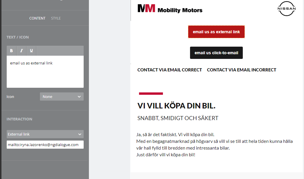
If it's a button, it can either be an external link and you need to add a "mailto:" prefix or choose "click-to-email" button type and no prefix needed.
.png)
¶ Link
For text links: you can type the email address and the system prompts you to add the prefix
.png)
.png)
¶ The reasons it may not work
The opening in Chrome as a new tab/window - this can be caused if you set up the button external link type and forget to add the prefix mailto: (the system does not prompts here as we have a specific button type). in case with the links, it happens when you click "cancel" and choose not to add the prefix. and other case - it may be connected to the settings of your device. But I cannot reproduce it as I don't know the settings of your Outlook.
¶ Unsubscribe Link
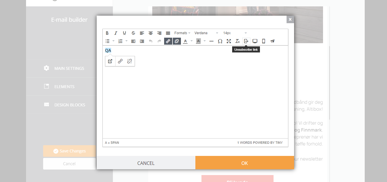
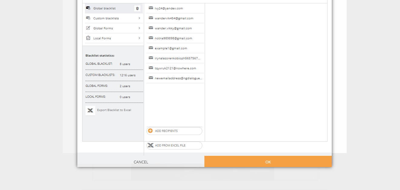
After clicking it, you are prompted to choose the blacklist (guide on blacklist).
Click OK after that and the link will be generated. When clicking the link (like that )
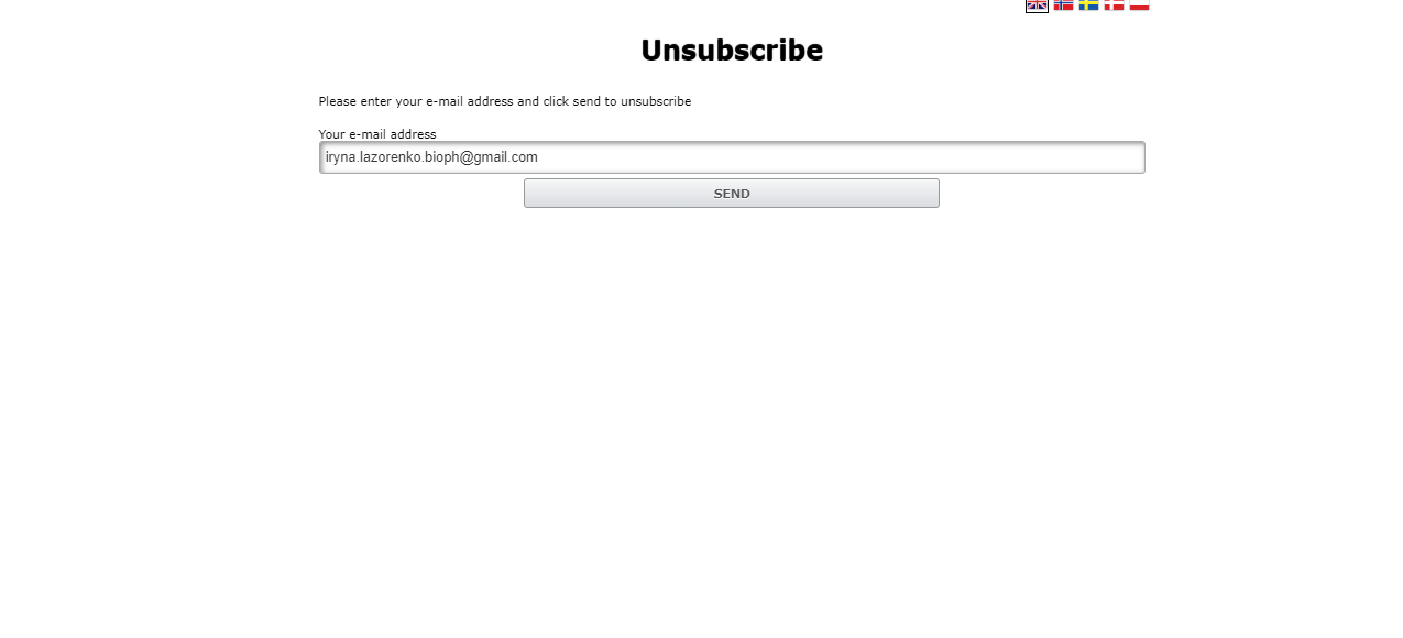
User will be offered to unsubscribe (their contact will get into blacklist).
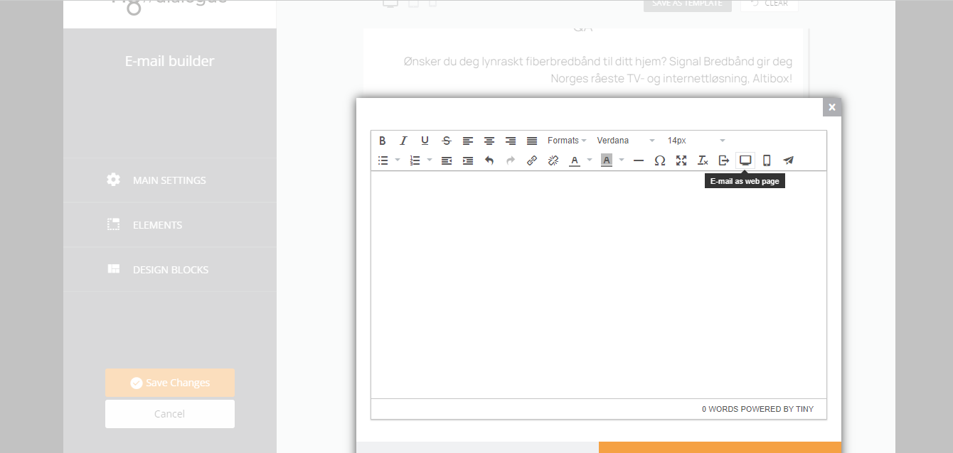
¶ Email Builder: See Email as Web-Page
To get the email open as a link “Trouble viewing this message? Click here”, you can use this feature:
More features are in development